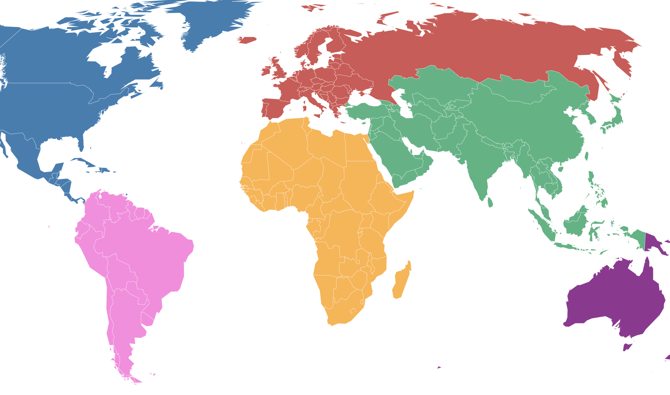
The Carbon Map provides current and historical carbon emission, extraction, consumption, and reserve data. The traditional Robinson map is used to start but can be shifted to show actual land area, population, wealth, people at risk, sea level, and poverty – helping students visualize and make connections between carbon emissions and the above listed factors.
Sustainable World Collaborative’s Analysis
We analyzed each resource in our database based on the Ways of Thinking from the Sustainability Education Framework for Teachers. We select only high-rated resources to include in the database. Below are our ratings and notes for this resource.
Systems Thinking

The Carbon Map enables students to see how their carbon emissions compare to other countries around the world. It provides groundwork for students to work with others to address our carbon emissions crisis. The map shows many interconnected systems that affect and are affected by carbon emissions – highlighting how marginalized communities are connected to our carbon emission amounts. The map is based on current research and specifically explains the different kinds of maps that are used.
Strategic Thinking

The map uses current data on world carbon emissions along with country poverty, wealth, population, sea level data and more. Additionally, the map provides historical data to show how the data has shifted over time. The map does not specifically propose solutions but the data could be use as a foundation for developing solutions. The Carbon Map specifically calls out correlations between vulnerable groups and carbon emissions.
Values Thinking

The Carbon Map does not specifically acknowledge their identities, biases, commitments, and orientations but rather present as neutral. The map does not provide alternative stories from the most vulnerable groups represented in the map such as those living in high poverty and does not acknowledge the stolen land represented on the map. The resources bring to light how marginalized groups are most affected by our carbon emissions.
Futures Thinking
The carbon map encourages users engaging with it to think ahead and propose solutions for our sustainability crisis. The map challenges the status quo by updating the data used for their map and providing various visualizations of the data to make it more accessible. The map does not provide any supplemental educational or forward thinking activities but the maps aligns with the organizations goals of making large data sets (like those on carbon emissions) more usable to the general community member, giving everyone foundational data to begin developing more sustainable solutions